


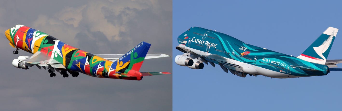
Growing up in South Africa, Johannesburg International Airport frequently had Boeing 747s visiting. Being SAA’s home base, Ndizani was one of my personal favourites, along with Qantas’s Wunala Dreaming which made the occasional visit. I remember picking up a family friend that flew in from Hong Kong early in the morning and I realised that something about the Cathay Pacific 747 looked different, only to realise it was their Spirit of Hong Kong livery.
Taiwanese carrier Starlux has been making waves since it boldly commenced operations just before COVID hit and most of the industry started shutting down. Despite its family issues with EVA Air, the space-themed airline is starting to spread its wings to many more continents now. Coinciding with its rapid expansion Starlux recently made headlines with the launch of its new special livery and accompanying amenities. I mean just look at this beauty:
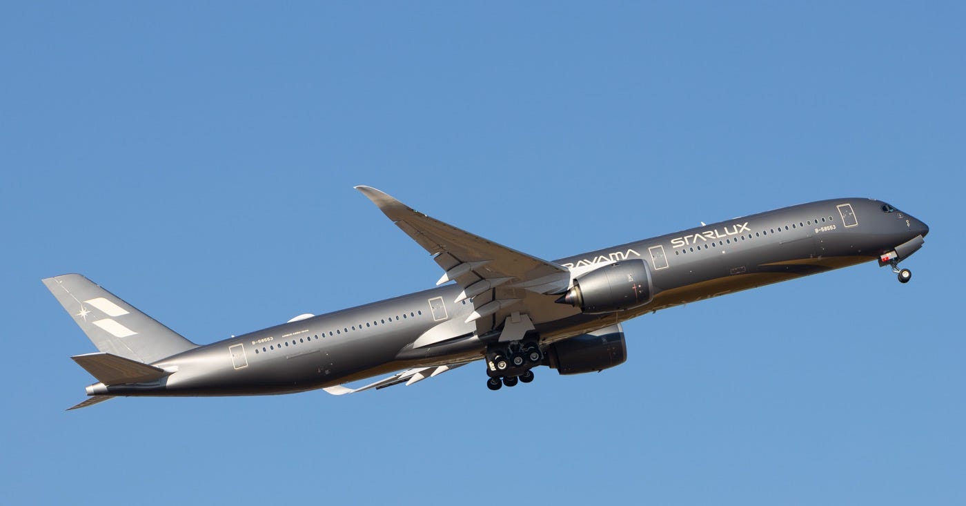
Back in January when Starlux announced the collaboration, I really had no idea who Sorayama was, but from media pictures he looked like an artist that works with metal and makes shiny things. That would explain why Chairman Chang wore a shiny silver bomber jacket at the press event? Not my cup of tea but I guess you’d do anything for marketing purposes.
But what makes this collaboration so close to the heart for me is how Mr Sorayama approached the project: the aircraft is a canvas, he’s not just creating a livery, he’s creating flying masterpieces. Sorayama was fully invested in the project, I mean he even created a whole webpage explaining the process and showcased all the details. (Note to airline marketers: that’s how you showcase a livery!)
One highlight that stood out to me was how Sorayama literally thought of every angle of the aircraft and made sure that it was recognisable from each angle. My favourite feature that many airlines neglect is that he even had his bold work mark on the top of the aircraft. While many airlines have it on the underside of the fuselage, having it on the top makes it a little more interesting at airports where you can see the top of the aircraft. It hasn’t been announced yet but I would love to stand on Hong Kong Airport’s SkyBridge and have it come underneath me just so that I could view those titles from the top.
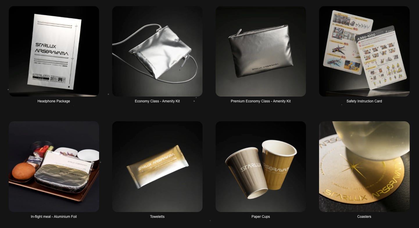
He even thought of every aspect inside the aircraft. Passengers on AIRSORAYAMA flights will get the full Sorayama experience with nearly every single aspect of their flight reflecting Mr Sorayama’s metallic style, from amenities, in-flight meals and a safety video (I always thought their alien cartoon safety video looked out of place anyway.)
Another highlight I really liked was how he actually used two aircraft to form a concept. I don’t know much about art but I do know that sometimes art pieces need to be viewed with all its pieces together. Sorayama did just that, while on their own they’re already masterpieces, he also emphasised that both the Silver and Gold (to be delivered soon) versions need to be viewed as a pair, describing it as “dialogue in motion across the horizon”.
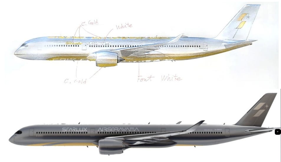
I must also give Starlux’s Chairman Chang credit. This collaboration works so well because of both Chang and Sorayama’s “rebellious spirit” to innovate and just try something new and I’m all for it. Back in 2013, American Airlines made the polarising decision to move away from their bare metal livery to a silver metallic livery. It is well known in the industry that new generation aircraft use composite materials and that bare metal just won’t work anymore. With Sorayama’s metal design language, Chang still pushed ahead with the collaboration, working together with Airbus to find a way to make this flying artwork a reality.
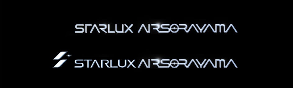
I won’t lie, I was ever so slightly disappointed when Silver came out a little darker and less metallic than expected, but I will still give Chang and Airbus props for staying as true as possible to Sorayama’s concept. Another critique I have is that I’m not a fan of using his typeface and branding. I understand that it’s his signature but replacing the Starlux font with his font does bring in a bit of brand dilution. I would also have preferred Starlux x Sorayama branding as opposed to STARLUXAIRSORAYAMA branding, which sounds a little like a Sorayama is starting his own subsidiary airline within Starlux.
However, these are all minor critiques and shouldn’t deter us from the fact that Starlux and Sorayama view liveries as a masterpiece and an aircraft as a canvas. I’ve written about this before, but with many airlines using liveries as a marketing tool, this collaboration brings a fresh spin that the industry desperately needs. I am secretly hoping that Starlux would even adopt it as their official livery across their fleet.
Seeing Starlux embark on this exciting collaboration hits hard as a long-time AvGeek, especially since my childhood was spent hoping today was my lucky day to see a special livery on the way to the airport. Fast forward twenty years later, Cathay Pacific relaunched their Spirit of Hong Kong livery on a Boeing 777-300ER and it is quite a disaster I should say. In stark contrast to Starlux treating the aircraft as a canvas, it almost looks like Cathay Pacific walked into WestK’s Museum of Art, pulled a few pieces off the wall, stuck them onto the aircraft overnight, and then added a WestK sticker at the back to remind us where it all came from. In actuality, it is art generated with a lot of help from AI: a rather polarising stance when you are trying to promote art.
So while it may seem like the days of us having art on an aircraft may have disappeared, Starlux is coming back and showing the aviation world what is actually possible. The livery isn’t necessarily perfect, but the concept is on point: the aircraft is a canvas and done correctly, aircraft are not just engineering marvels, they are flying masterpieces.