

This has got to stop
Why Thai Airways' new business is part of a worrying trend in the industry

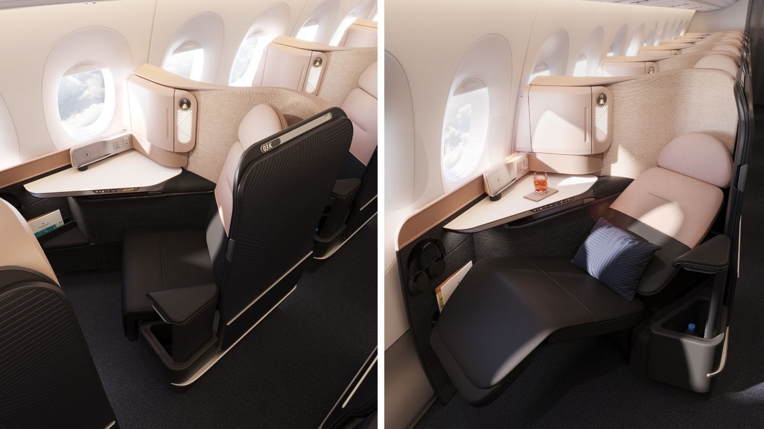
This week THAI Airways revealed their new business class. Let’s play a game, it’s one of these three:
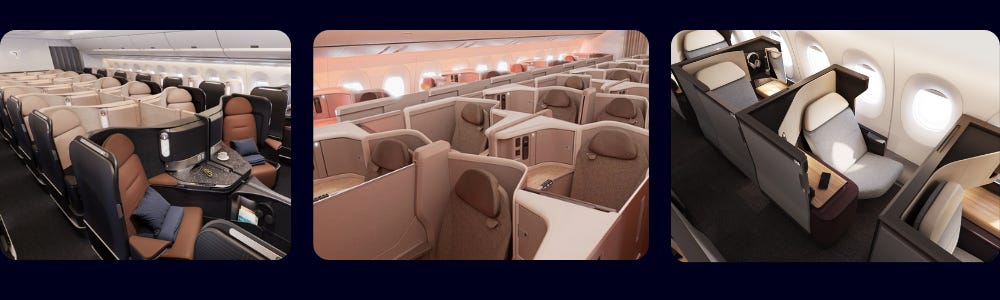
Can you spot it? None of the above screams “THAI Airways”, but rather the same generic warm colours copied and pasted (It’s the first one, by the way)
I feel like every month an airline is showing off its newest business class only for it to look like the new business class from the previous month. All of them having the following features: brushed metal or aluminium, brown and warm tones, and of course a sliding door. If it’s not for the airline logo on the bulkhead, you’d really not be able to differentiate any of them. Here’s a list of more airlines using the similar colour palette:
American Airlines Flagship
Cathay Pacific Aria
Emirates Business Class
Etihad Business Class
Korean Air New Business Class
Qantas Business Class
Starlux Business Class
Turkish Airlines
Unlike the term “eurowhite” was coined from European airlines creating a majority white fuselage with some colour on the tail, something is starting to happen inside the aircraft that we may not necessarily see. I would really like to say this has been influenced by Scandinavian interior design choices which we see nowadays, warm natural colours; it is also reflective of more premium materials used in premium cabins like leather or wood accents.
This trend may have started with Emirates as it has always been part of the airline’s branding to lean into the sandy desert colours of Arabia, with all three (and now four) classes of travel featuring a combination of brown and creamy colours. With the airline becoming a global powerhouse, it may have been the standard that steered many airlines to use a similar colour palette to be associated with the more premium feel.

In some cases it may actually work without it looking like an airline is trying too hard to impress. Singapore Airlines for example also has brownish looking Business Class, but with brand colours featuring dark blue and gold, it’s not too far off. Newcomers Starlux and Etihad also have brand colours featuring black, gold and brown so using these colours in their cabins is a no brainer.
On the other hand, some airlines use these colours and designs as a design language. Cathay Pacific has had a specific design language for its lounges in partnership with Studioisle. When the Aria was introduced the airline tried to replicate the design language. With all of Cathay Pacific’s lounges featuring a similar design language, the colours chosen for the Aria is a natural choice. Similarly, China Airlines used a similar design language inspired by bamboo and papyrus that complements the plum pink and purple of the airline in its cabins.
However, this is where my gripe with THAI and other airlines comes in: they do not feature any brown or gold in the branding or marketing, so why use it? It feels very disconnected with the rest of the branding. I have always associated certain colours with certain airlines, with THAI it has always been purple and pink, and the dull brown cabin is a stark contrast to what I have seen. Similarly, when Air Canada revealed its Signature Cabin, the brown cabin felt so far off from its white, black and red branding that I struggled to connect it to the airline.

I can understand that airlines such as Cathay and China Airlines are trying to create a “home away from home” type of cabin in the sky, especially with the airlines trying to incorporate a design language. But now it seems like every other airline is doing a copy and paste of warm colours into their business class cabin that airlines seem to be too lazy to create any form of differentiation in their premium cabins. Do not forget, with many economy class passengers also walking past the business class cabins during boarding and disembarkation, it seems like such a wasted opportunity for airlines to use these cabins as a wow factor to convince economy class passengers to upgrade next time.
A well designed cabin not only has the opportunity to impress, but even more elevate the airline as a brand that passengers can associate with. For example, my first ever business class flight was in Qatar’s QSuite, and one of the reasons I did it was that I walked past the QSuite on the way to my lowly economy class seat and it left such an impression on me that I felt like all the hype was warranted. With the new Riyadh Air launching, their business class draws inspiration from the deserts of Saudi Arabia mixed with the lavender purple from their brand, and just by looking at the pictures it clearly shows that they mean business.
So with THAI releasing their business class pictures, it feels like they just took a seat from the product catalog and called it a day. Nothing screams THAI, and nothing seems very inviting. But unless they plan to change their livery to brown gold with the orchid, it just looks like any other cosmetic upgrade in business class.